how interior designers move beyond safe art without losing client trust
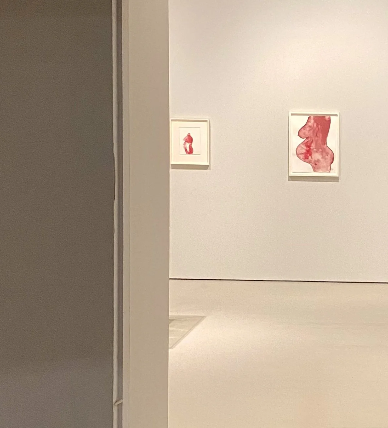
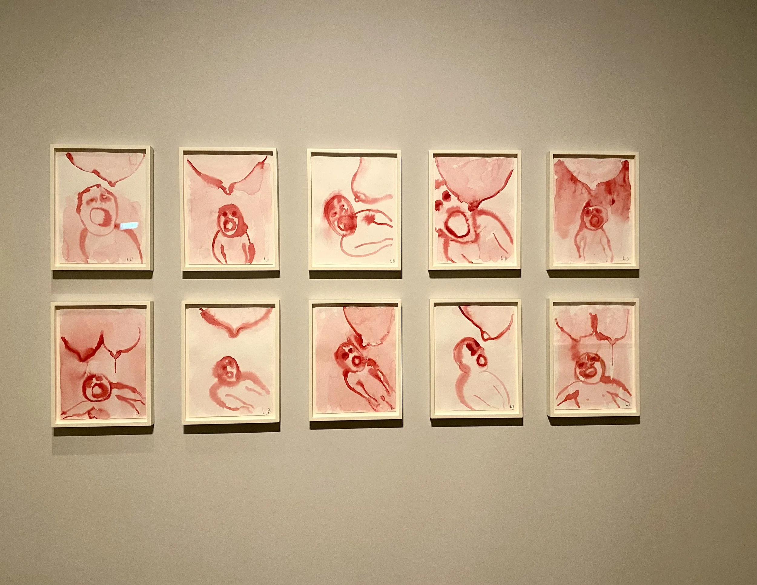
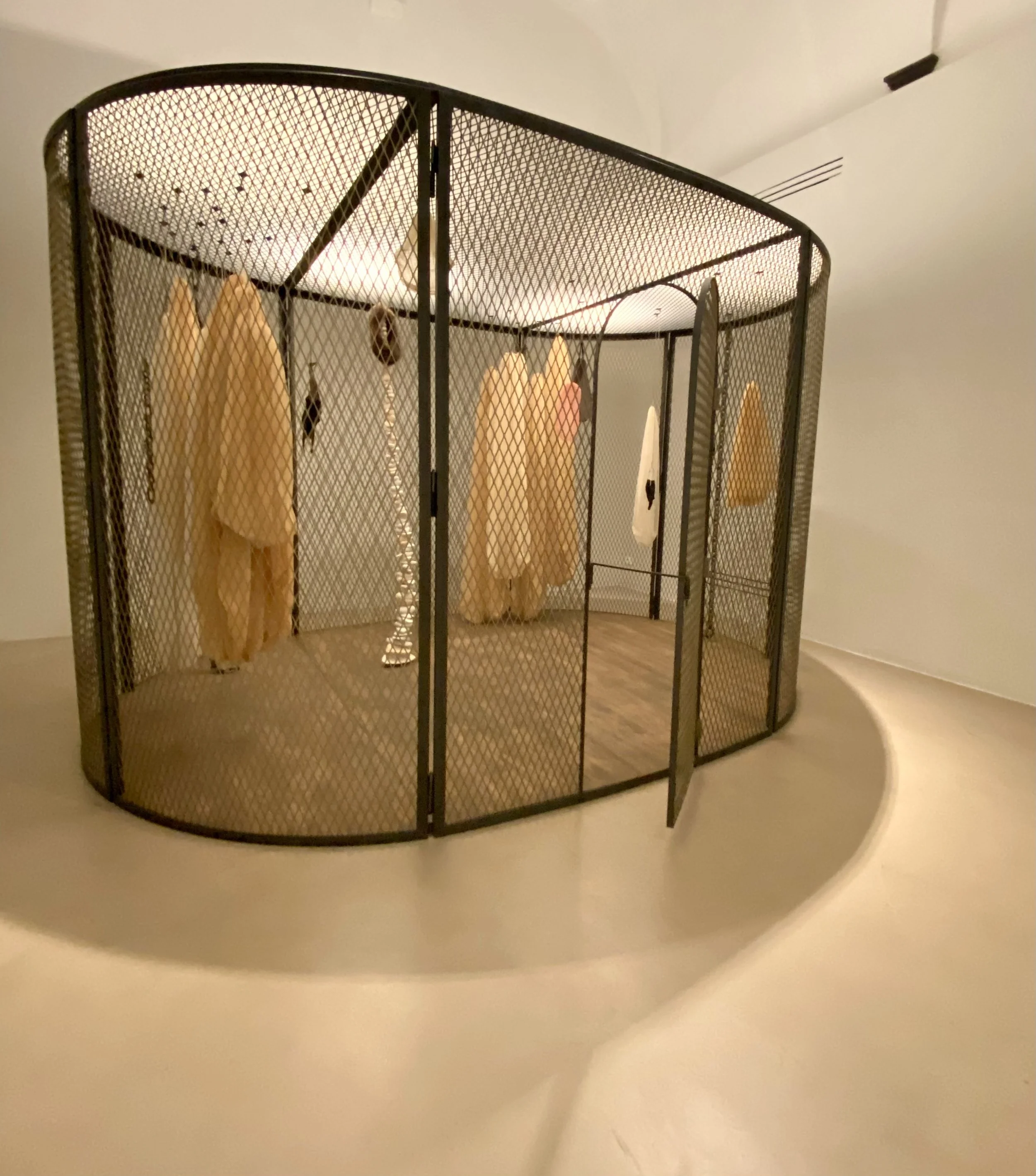
Exhibition detail from “Do Not Abandon Me” / Louise Bourgeois, at Museo Novecento, October 2024
“Maybe we should just go with something neutral.”
I can’t tell you how many times I’ve heard a version of that in a project meeting.
Often we think if a piece of art is emotionally charged, it’s going to take over the room and be… too much.
In interior projects, that’s often the moment something full of meaning and depth gets swapped out for something “nice.”
I remember seeing Marina Abramović’s Intimacy With Strangers in 2018 at Palazzo Strozzi in Florence, where two fully nude models stood facing each other and visitors were prompted to walk in between them - grazing their nakedness - but more than that, forced eye contact in an incredibly intimate way. I couldn’t bring myself to do it. I watched my partner pass between them while my overly religious Okie upbringing had a slight panic attack. I walked around instead.
At the time, I thought, “this is a bit inappropriate for a public space.” It wasn’t the sexuality that got to me - it was the deeply exposed vulnerability. A part of me feared I would face them and cry at their strength, courage, and humanness.
Eight years later, I see art (and life) in a whole different way (…and still regret that I didn’t get the full experience of Marina’s vision).
Sure, this was a contemporary art exhibition - not a home, hotel, or hospital that I’m accustomed to helping clients select art for….but the underlying dynamic is the same. If I presented something with that level of vulnerability, the first reaction would likely be: “ohhh, that’s a bit too intense.”
But behind that is just fear: upsetting visitors, appearing dramatic, being misunderstood.
“Too much” is usually code for “this touches something personal.” That realization stayed with me - and it led me to look more closely at what we’re actually protecting when we choose safe art.
Exhibition detail from “Do Not Abandon Me” / Louise Bourgeois, at Museo Novecento, October 2024
Neutrality = Fear of Being Seen
Often, when we choose safe artwork (abstract, tonal, decorative) we’re actually protecting our reputation - or our own taste being questioned.
Developers are scared that art feels so visible and permanent in their projects - and that paralysis leads them to safe… and boring.
Designers fear their clients (and peers) will judge their choices, so they stick to the trends.
Collectors (especially first-timers) fear that their investment will not hold value or that their guests could question their ‘out of the norm’ choices.
But what does that “neutral” really communicate?
Neutrality is never neutral. It quietly signals: “we don’t want to risk discomfort here.” When the art refuses to reveal anything, it blends in, and the room doesn’t feel safer… it feels flatter.
When does “neutral” become forgettable?
Usually when it’s only echoing what’s already there - matching the palette, staying inside the lines, reciting what everything else around them is saying - instead of expanding it.
Simply put, neutral art is the good girl. It behaves. And in doing so, it rarely moves anyone.
In my 15 years of work in spatial projects, I’ve seen (and contributed to!) more than a few spaces that were beautifully designed - but emotionally vacant. Everything matches, but… it’s missing the oomph - the piece that sparks the conversation, grabs your attention in a sea of neutrals or makes you pause, even for a second, in the middle of an otherwise fast day.
That realization led me to question what boldness actually looks like in practice.
Because in the age of Google and ChatGPT, answers are easy. They’re instant, polished, efficient.
But art isn’t here to provide answers. It’s here to ask better questions.
It’s the piece that makes you linger a little longer than expected. The one that gently unsettles your certainty - not to create chaos, but to reopen curiosity.
Wonder is already inside us. We feel it standing under a starry sky - and art can carry that same energy inside a space….not by perfectly matching everything around it, but by daring to ask something more.
Exhibition detail from “Do Not Abandon Me” / Louise Bourgeois, at Museo Novecento, October 2024
Generic Art can Silence a Space
Generic is what people remember least - and yet the fear of getting it wrong naturally pushes projects toward that safe zone. Safe art doesn’t just blend in - it mutes the energy around it, like someone at a party pointing out what’s “not quite right,” quietly dampening the mood.
The design itself can be strong - the lighting, layout, and finishes all on point.
Then there’s the safe art - neutral, polite, and….dull.
But, what’s the art you remember most? The piece that blends in (“oh, that’s nice”), or the one that makes you do a second look and keeps you thinking days, weeks, months later?
Those are the pieces that are hardest to choose - and to fully stand behind.
We need weirder, bolder, stronger art.
The space deserves that. Your client deserves that.
Exhibition detail from “Do Not Abandon Me” / Louise Bourgeois, at Museo Novecento, October 2024
Strong Work Doesn’t Shout
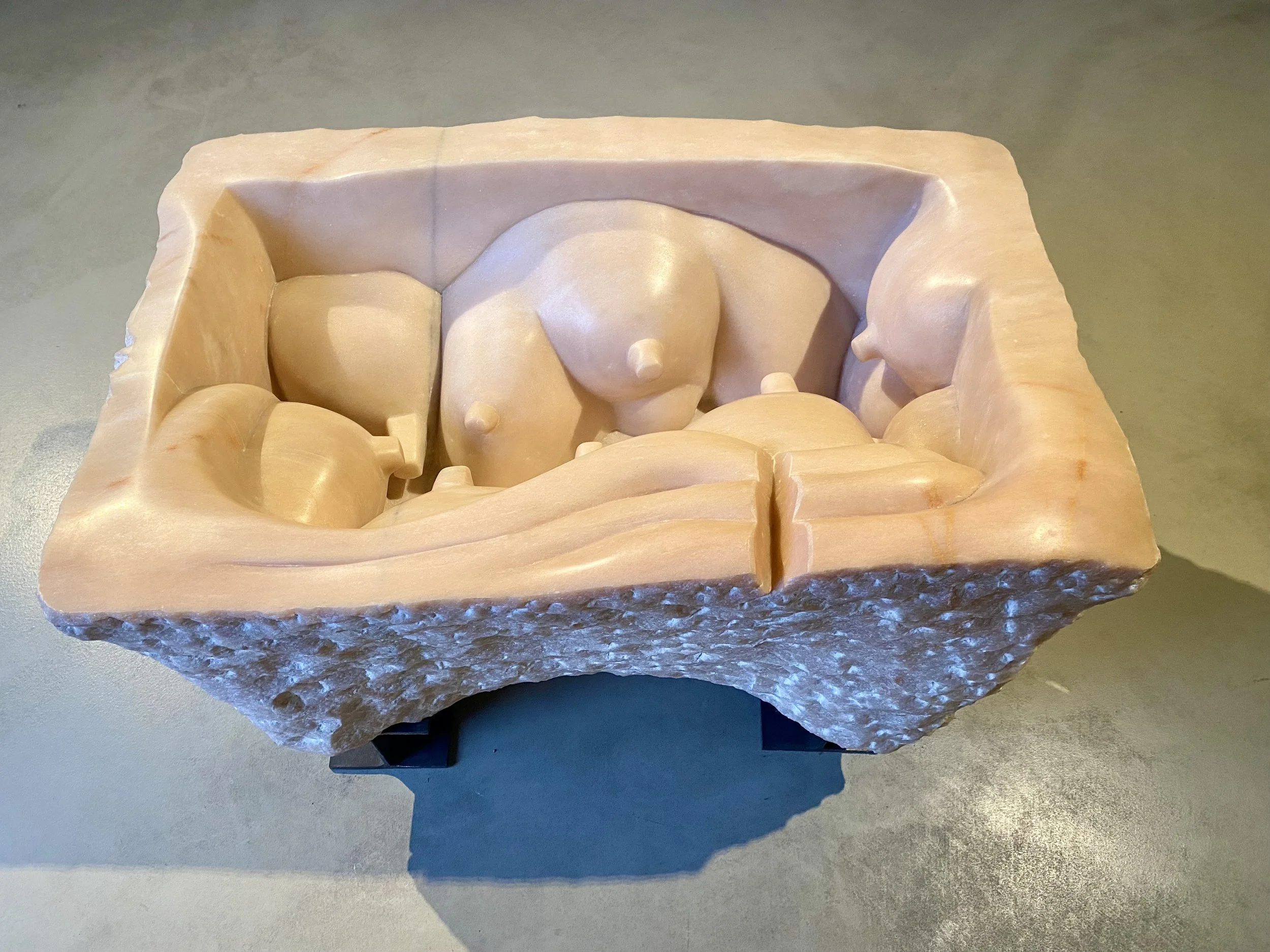
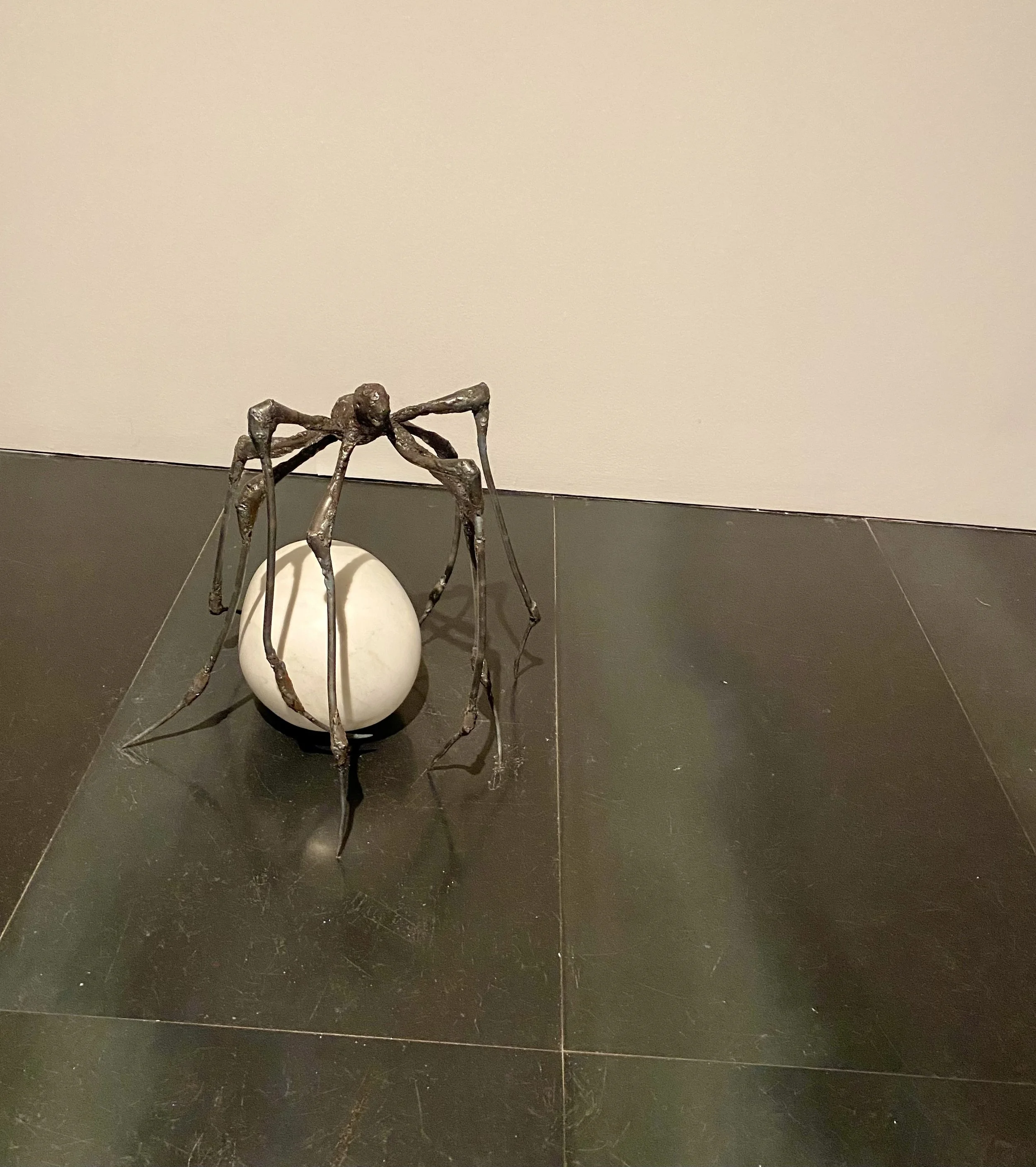
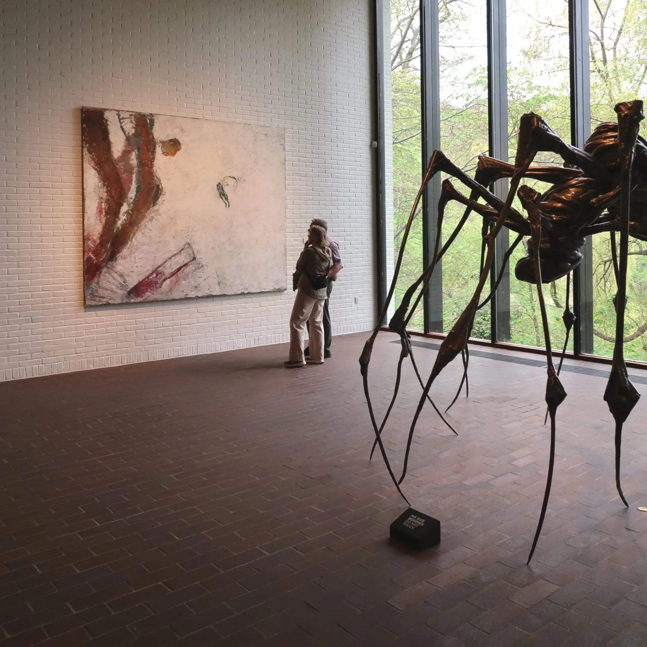
The work of Louise Bourgeois - most famously known for her large bronze spider sculptures - is emotionally unapologetic. It’s psychologically charged, direct in it’s material… and never neutral.
That’s the lesson: strong work doesn’t decorate. It occupies.
At the 2024 exhibition Do Not Abandon Me at Museo Novecento, this was clear. Her work is deeply personal (grief, memory, the body) and still incredibly composed.
Emotionally honest work can feel “too much” at first. Think about Bourgeois’ work: the cells, the blood, the breasts, the spiders - confronting as if the art is looking through you.
What I remember most about the exhibition was the personal connection I felt to the work. The theme of motherhood - her relationship to her mother, her own choices as a woman - hit me hard. As a child, Bourgeois cared for her chronically ill mother. Later, she refused motherhood herself - saying she needed a mother more than she wanted to be one.
Despite the intense emotions through her work, it’s never chaotic or loud.
Designers often think they’re choosing something “balanced,” when really they’re smoothing edges to avoid impact. But when you choose with intention, art can be emotionally powerful without overwhelming the room.
Confidence isn’t boldness for its own sake. It’s placing something meaningful in a space.
And not apologizing for it.
The key is trusting the space - giving the piece breathing room, allowing the architecture to support it and the materials to speak to each other.
Trusting that the room - and the people in it - can meet it there.
Exhibition detail from “Do Not Abandon Me” / Louise Bourgeois, at Museo Novecento, October 2024
bold-but-aligned philosophy
When time and budget are tight, safe choices are easy choices.
But pushing past what’s ‘available’ to what’s aligned takes time. It takes vision. It takes knowing where to look, but also feeling into what the space is asking.
Familiar choices that match the finishes are simpler - but they may not be the most beneficial in the long run.
For bold art choices to fit the space, ask:
What’s this piece actually doing here?
Does it deepen the story of the space?
Will people feel it - not just see it?
Is it aligned with our values?
And how will we know it’s working?
This isn’t about critiquing the art - it’s about seeing how it works in a space.
How it moves from decoration to story.
The lesson from Louise Bourgeois is clear: don’t shy away from the emotional, or the unusual. And, sure, while museums may have the freedom to really push limits, we can take that boldness as inspiration for all the spaces we shape - public or private.
We owe it ourselves (and our clients) to move away from safe or generic art and choose art that’s bolder, weirder, stronger.
Confidence in your choices - plus the courage to let a piece fully exist - is what makes a space really feel alive.
Let me know in the comments what’s been most useful for you here.
Natalie Lytle
Contemporary Art Advisor / Artful Edit
View my bio
KEY IDEAS:
1. Neutrality Is Never Neutral (Why Neutrality is often just a fear of being seen)
2. Strong Art Doesn’t Decorate - It Occupies
3. “Too Much” Is Usually Fear
4. Confidence Means Not Apologizing